Overview
A new chapter begins for this storied club, bringing together five historic boroughs under one unifying banner. Their existing visual identity — though it carried tradition — needed a renewed look that reflected collective spirit, deep heritage, and unwavering ambition. The mission: create a modern, iconic crest merging the boroughs’ individual stories while honoring the club’s legacy on and off the field.
Challenge
- Outdated crest with limited scalability for apparel and digital use.
- Disconnected symbolism that didn’t fully represent the five boroughs.
- Need for a design that resonates with both long-standing members and new players.
Process
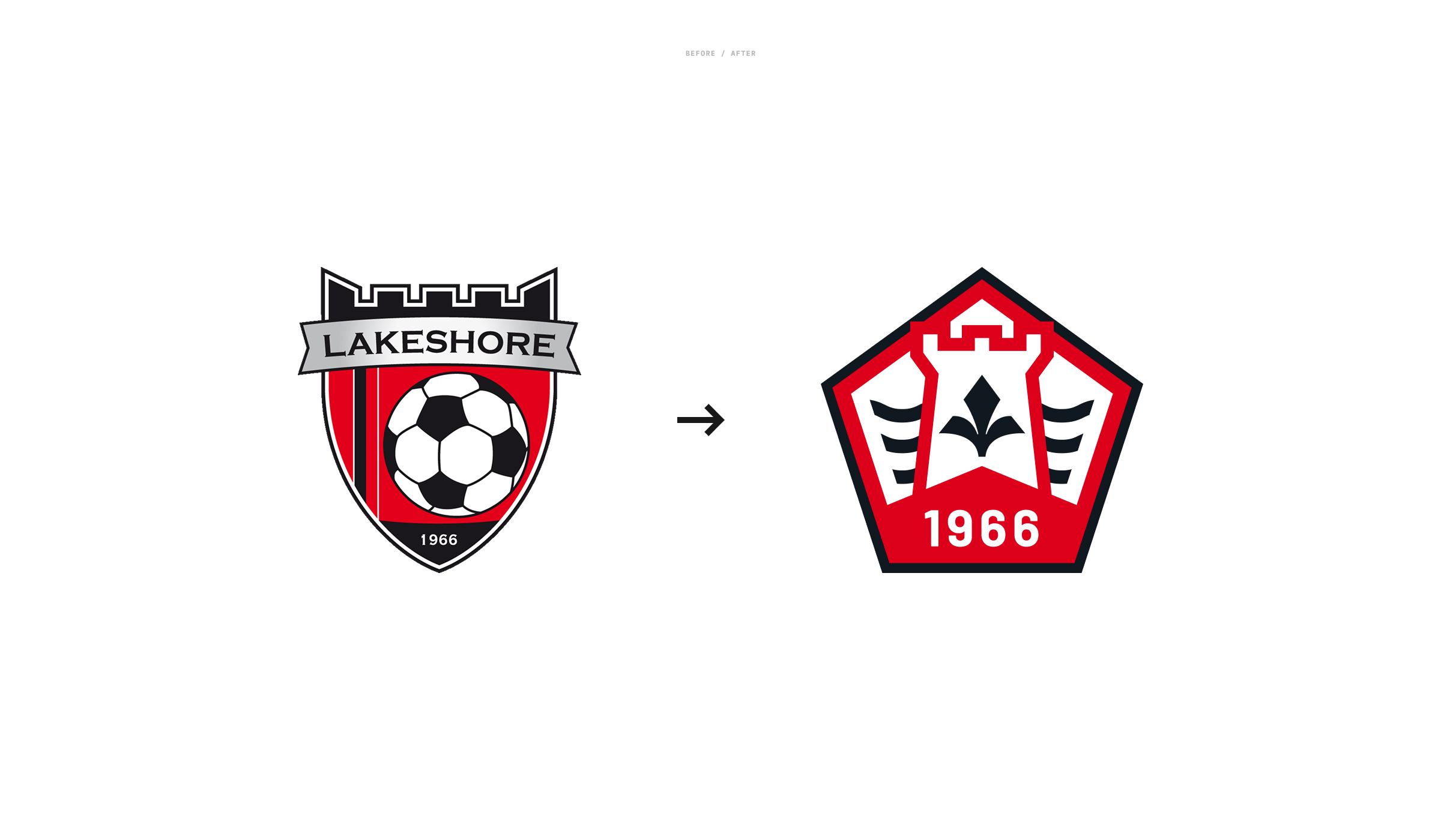
- Heritage Research – Studied the history, culture, and coat of arms for Baie d’Urfé, Senneville, Sainte-Anne-de-Bellevue, Kirkland, and Beaconsfield.
-
Symbol Development – Crafted elements representing unity, pride, and competitive spirit:
- Pentagon Shield → Five sides for the five boroughs, echoing a soccer ball pattern.
- Tower Castle → Symbolizing defense, strategy, and borough heritage.
- Three Waves → Honoring the waterfront and local geography.
- Fleur-de-Lys → Connecting to Quebec’s culture and resilience.
- Design Refinement – Iterated for scalability, legibility, and balance across applications.
- Identity System – Built secondary marks, wordmarks, and alternate logos, including “Defend the Shore” rally branding.
Outcome
- A bold, contemporary crest that unites the five boroughs in a single, memorable emblem.
- A complete identity system adaptable for jerseys, merchandise, digital media, and signage.
- Rallying cry “Defend the Shore” embraced by players and fans as part of the club’s culture.
Results
- Immediate adoption across all teams and age groups.
- Strong positive reception from players, parents, and the wider community.
- Enhanced club presence at matches, tournaments, and in social media coverage.